Advanced AppSet Design and Manual Editing
In this section, we round up some tips and tricks for the advanced AppSet designer. The Configuration Wizard is almost always the best way to configure each element in your AppSet. However, there are occasions where some manual work and advanced techniques are necessary to finish your AppSet and have it work the way you intend. You might also want to manually enter in data and values. Let's explore all these areas.
Basic Settings
By default, all elements show their basic view. You can see at a glance the most important items that the Configuration Wizard has configured, as shown in Figure 142.
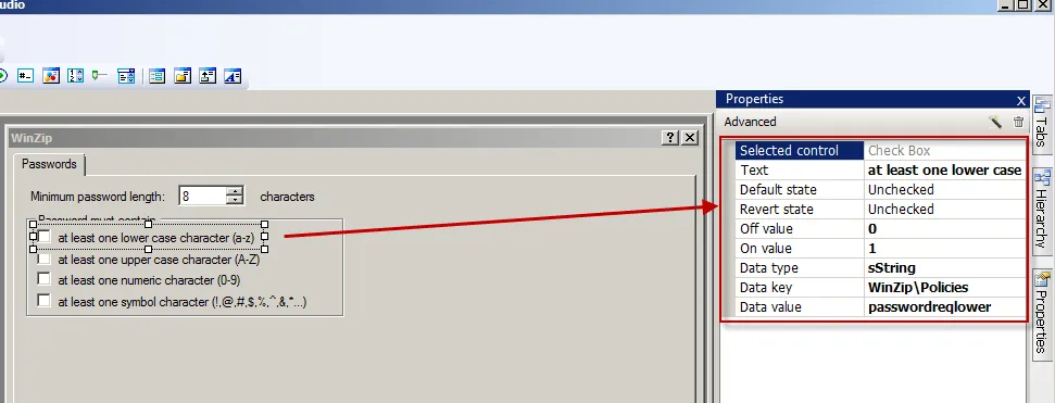
Figure 142. The basic properties of an element.
The Configuration Wizard should auto-fill in all basic properties for most items. However, one item that might need attention is the label link. Remember, the label link is the item that describes elements that have no text, like text boxes, spinboxes, dropdowns, sliders, and radio button groups. To configure the label link for an item, click on "Label Link" in the properties of the item, select the "…" (not shown), and then select the text on the page that most closely represents what the text box, spinbox, etc. is trying to configure. In Figure 143, the radio button group is being described by the text "Associated image viewer."
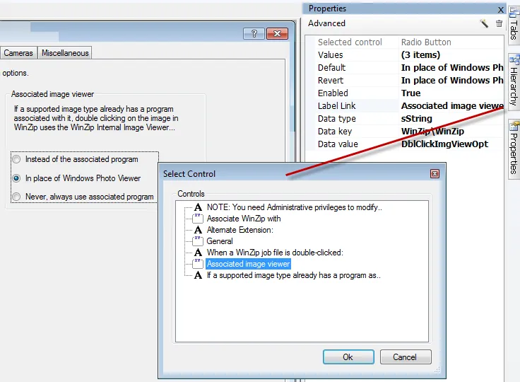
Figure 143. Example of an element's label link.
Advanced Settings
You can also click the "Advanced" button within Properties to see more detailed information about an element, as shown in Figure 144.>
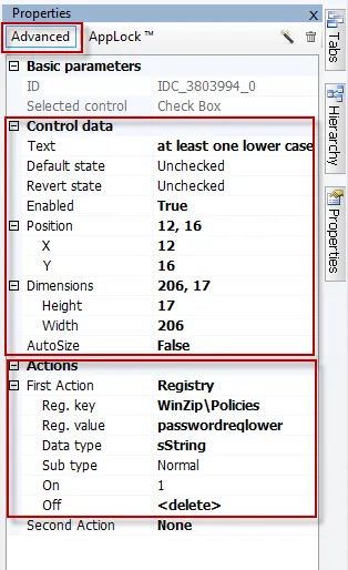
Figure 144. The "Advanced" button in the Properties dialog.
The Advanced menu contains sections labeled "Control data" and "Actions." The control data specifies items like dimensions, the display name ("Text"), the default state, the revert state, whether or not the item is disabled ("Enabled"), and whether or not the item's text will stretch within the boundaries of the element's handles ("AutoSize"). The Actions area shows what occurs when the checkbox is checked. In Figure 145, you can see the following:
- "First Action" performs a registry update.
- "
Reg. key" is set toWinZip\Policies. This field is always relative to the data root, so the whole key is not usually shown. You will often see only<project root>there as well, signifying the value is directly within the project's data root. - "
Reg. value" is set to "passwordreqlower," the value in the registry. - "Data type" is "String" (string registry type)
- "Sub type" (registry elements only) can be "Normal" or "Masked." "Normal" is the usual type, and "Masked" is automatically chosen when the value is detected as a binary value with a mask, which specifically flips specific binary bits on or off.
- The On value is 1. When the checkbox is checked, it sets the value to 1 inside "passwordreqlower."
- The Off value is 0. When the checkbox is un-checked (or the Group Policy falls out of scope) the value inside "passwordreqlower" is deleted.
It's possible to see (or set) second and third actions when an element changes. You can dictate values within any of the supported datatypes, as shown in Figure 145.
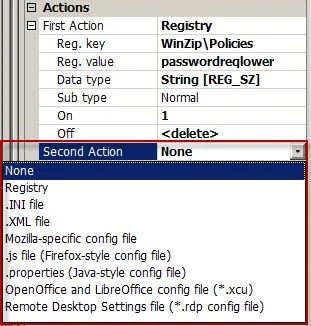
Figure 145. Examples of second actions.
You might want to do this if you had to configure both a registry item and also an INI file when a checkbox is checked. This is a very rare occurrence, but it does happen.
After selecting the data type (Registry, INI, XML, etc.) you are then prompted for the section and property (or registry key and registry value), which in Figure 146 are shown as "[MainFrame]" and "AdvertiseIndex."
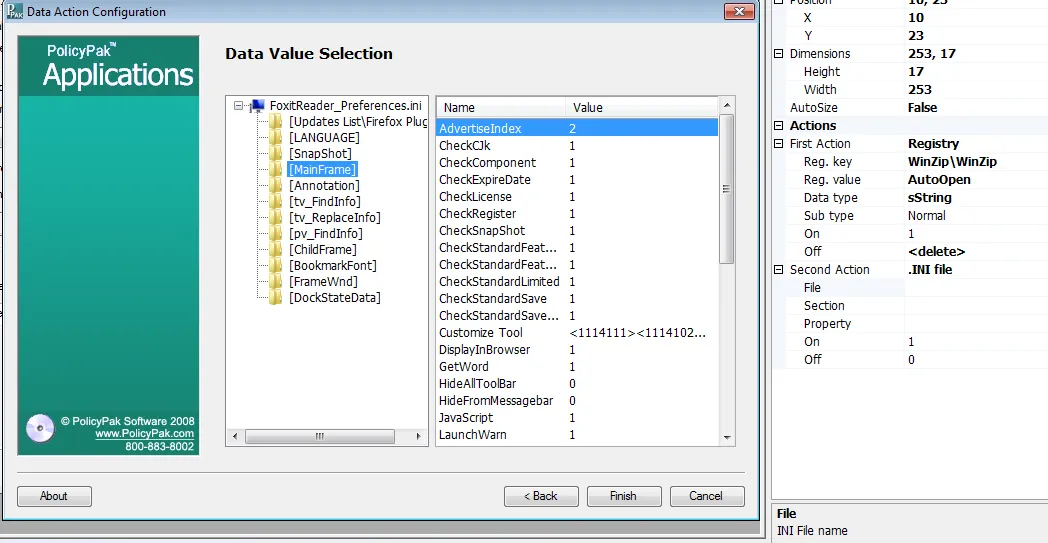
Figure 146. Selecting the section and property.
Once the value is manually selected, you are able to place the value automatically within the On or Off values (or both or neither), as shown in Figure 147.
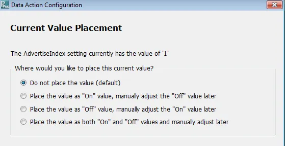
Figure 147. Placing the value within the "On" or "Off" fields.
After placing the items, you can further specify the On and Off values within the action itself, as shown in Figure 148. Checkboxes are only allowed three actions.
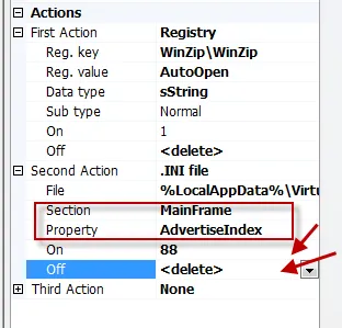
Figure 148. Specifying "On" and "Off" values within the action.