Data Grid Functionality
All data grids within the Access Analyzer Console have functions and features that allow Access Analyzer users to group by, filter, and sort via the filtration dialog through the data.
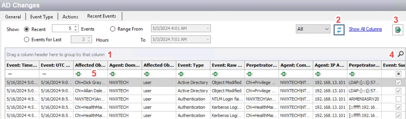
The different grouping, filtering, and search methods in the Data Grid are:
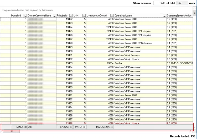
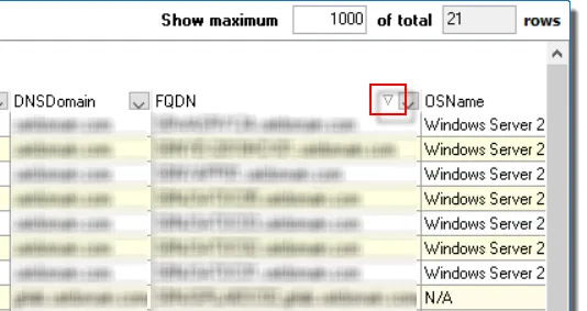
The Show maximum [value] of total [value] rows, located in the upper-right hand corner of the Data Grid view in the Results Pane, indicates how many rows of data are available within this data grid (the first value) and how many rows of data are available in the Access Analyzer database for this data grid (the second value). The maximum value can be changed by the user and only affects the maximum number of rows available for this data grid within the Access Analyzer Console. The total value is automatically supplied from the Access Analyzer database and cannot be changed by the user. If the total value is less than the maximum value, then all available data for this grid is present for sorting, filtering, and searching.
Data Grid Right-Click Menu
The right-click menu that affects data grid functionality is accessible by right-clicking on the data grid header row.
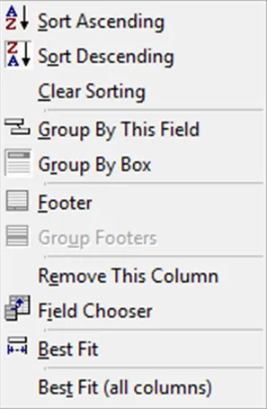
The Data Grid Right-click menu contains the following selections:
- Sort Ascending – Sorts data by selected column in alphanumeric order
- Sort Descending – Sorts data by selected column in alphanumeric order
- Clear Sorting – Removes all sorting from selected column
- Group By This Field – Groups data or clears grouping of data by selected column
- Group By Box – Hides or shows the Group By Box where headers can be dragged-and-dropped to group the data
- Footer – Provides a data grid summation row at the bottom of the data grid (see the Footer section)
- Group Footers – Provides a data grid summation row at the bottom of each group (see the Footer section)
- Remove This Column – Removes selected column from the data grid
- Field Chooser – Opens the Customization window (see the Customization Window section)
- Best Fit – Changes column width to fit the data within the selected column
- Best Fit (all columns) – Changes column width for all columns to fit the data
Some data grids include right-click menus for actions on the data. See the corresponding sections for information on right-click menus within a data grid.
Customization Window
The Customization window can be used to customize the data grid to only display specific columns.
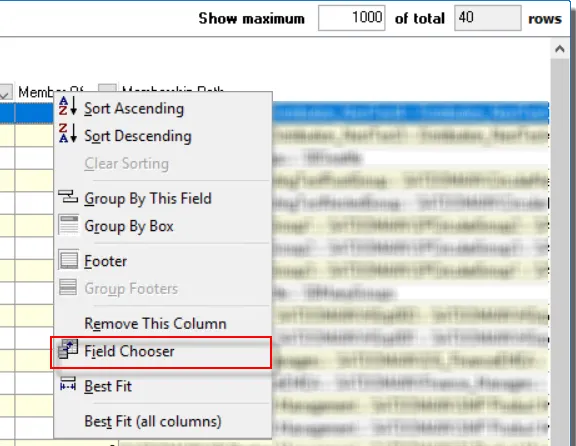
To open the Customization window, select Field Chooser from the column header right-click menu.

Any column that has been removed from the data grid, either by dragging it off the screen or by dropping it into this window, will be listed here. A column not currently displayed can be returned to the data grid by dragging-and-dropping it from this window onto the header row.
Footer
The footer provides a data grid summation row. The summation capabilities exist for every column on the footer either for the entire data grid or by grouped sections of the data grid.
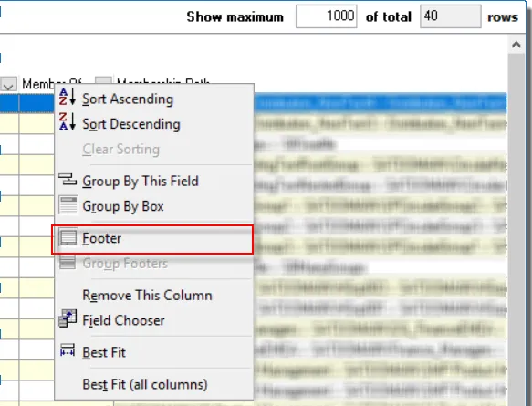
To enable the footer, right-click in a column header and select Footer from the right-click menu.
The footer appears as a gray bar at the bottom of the grid (or grid group). Right-click on the footer under the desired column. Only the options applicable to the desired column will be valid for selection.

The different footer options are:
- Sum – Available for columns with numeric values, adds all values in the column
- Min – Available for columns with numeric values, identifies the minimum value in the column
- Max – Available for columns with numeric values, identifies the maximum value in the column
- Count – Counts the number of records within the column
- Average – Available for columns with numeric values, calculates the average value for the column
- None – Removes the selected summation
Sort
The data grid can be sorted in alphanumeric order by clicking on a column header.
An arrow displays on the column header indicating if the sort is increasing or decreasing. This feature only works on one column at a time.
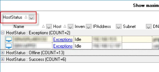
Group By
Users can interact and search through data grids in the Results Pane.
|  |
| ----------------------------------------------------------------------------------------------------- | -------------------------- |
| Default view | Organized by Column Header |
|
| ----------------------------------------------------------------------------------------------------- | -------------------------- |
| Default view | Organized by Column Header |
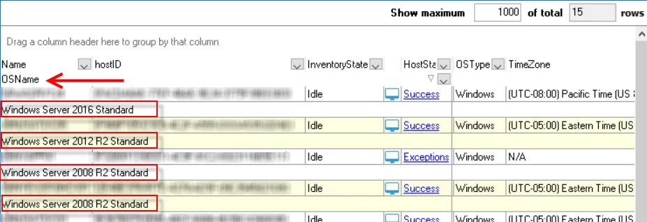
To use this feature, drag a column header into the “Drag a column header here to group by that column” area. The data grid groups according to the data within that column. The sub-header provides a ‘count’ of records within each group. Expand the group to view the data.
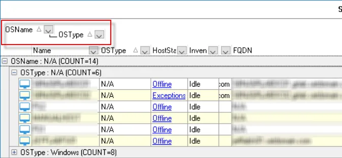
Multiple columns can be dragged into the Group By area to form tiered groupings.
NOTE: Sorting by the FQDN column is an easy way to see if there are two entries for the same host.
The data grid can also be grouped by dragging a column header beneath the other column headers either to the stationary section on the left or to the mobile section on the right. Each record counts as a single row for the total rows value, but displays in two rows with the second row dedicated for the moved column.
Drag the column header(s) back to the table to remove the grouping or use the Clear Sort option in the Data Grid Right-Click Menu. Additionally, the sort will clear when the user navigates to another place in the console.
Filter
Users can filter and search data in the Data Grid by using the dropdown arrow in the column headers to select from a list of filters, configuring a custom filter, or by using the Data Grid filtration dialog located above the Activities Pane.
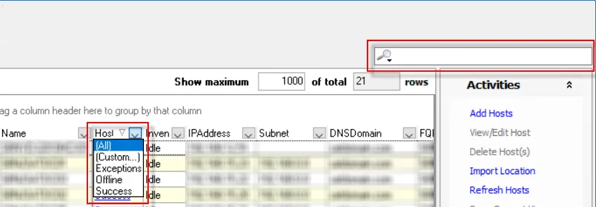
In the header of every column is a drop-down arrow. This provides users with the ability to filter the data grid for a particular item or items within a column. The drop-down menu has the options of (All), (Custom…), and an alphabetical listing of all items currently within that column for the data grid.
- Custom Filter – Click Custom Filter in the header dropdown to open the Custom Filter window
- Filtration Dialog – Click the Magnifying Glass icon in the Filtration Dialog to select a specific filter
Custom Filter
The Custom option opens a Custom Filter builder for the selected column.

The Custom Filter window options are:
- Show rows where
- First Comparison Operator – Select from a list of different logical operators that will apply to the first custom filter criteria
- AND/OR radio buttons – Select logical relationship between the first and second custom filter criteria
- Second Comparison Operator – Select from a list of different logical operators that will apply to the second custom filter criteria.
- Two wildcard options:
- The underscore (_) can be used to represent any single character
- The asterisk (*) can be used to represent any series of characters
Creating a Custom Filter
Follow the steps to create a Custom Filter:
Step 1 – Click the dropdown arrow in the column header for the column where the Custom Filter is going to be applied and select (Custom…) from the list. The Custom Filter window opens.

Step 2 – Set the desired criteria for the custom filter. Select the logical operator from the drop-down menu on the left and set the criteria in the textbox on the right.
Step 3 – Select either AND/OR and set the second criteria field, following the same method as Step 2.
Step 4 – Click OK to confirm changes. The custom filter criteria is now applied to the Data Grid.
In the example above, OSName is like *2008* AND not like *Standard*, the filter returns all data records with an operating system name that contains “2008” but not “Standard,” e.g. Windows Server 2008 Enterprise Edition, 64 bit and Windows Server 2008 R2 Datacenter Edition, 64-bit, etc. Complex filters can be created using the Advanced Search option in the Filtration Dialog.
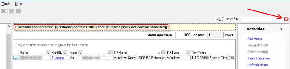
The selected filter criteria will appear at the top of the data grid. A red X appears in the filtration dialog, and the total rows value drops to the number of records that match the filter criteria. Additional filter statements can be added for other columns by repeating the process to build complex filters. The filtration dialog also provides other ways to filter and search the data set. See the Filtration Dialog topic for additional information on this feature.
Filters can be cleared by clicking the red X in the filtration dialog (to clear all filter statements), selecting All from the column’s drop-down menu (to clear filters one column at a time), or by navigating to another place in the console (to clear all filter statements). However, the Recent Filters option in the filtration dialog provides a list of the most recent filters applied to the data set for users to quickly return to a filtered view.
Filtration Dialog
The filtration dialog in the upper-right corner with the magnifying glass icon provides additional filtering options.
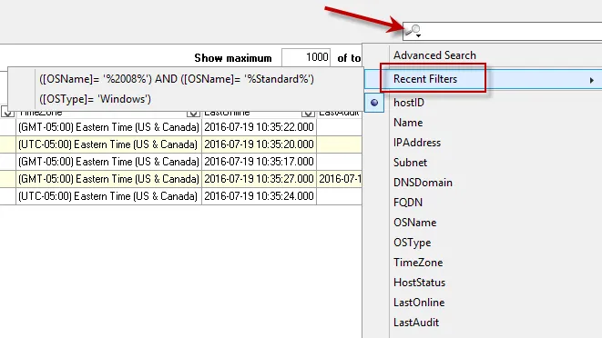
The magnifying glass icon opens a dropdown list of columns for the selected data grid, the Advanced Search option, and the Recent Filters list. Typing in the textbox at the top filters the data grid for the selected column (identified by the black dot). Hover over the Recent Filters menu item to open the list of the last server filters applied to this data grid.
Advanced Search
The Advanced Search option opens a Set Filter builder for users to build a filter for multiple columns using multiple logical operators.

The filter options and logical operators are:
- Filter Button – The Filter button opens a menu with the options to:
- Add Condition
- Add Group
- Clear All
- Logical Operator – The logical operator (red text) beside the Filter button can be changed by
clicking on it to open a menu with:
- AND
- OR
- NOT AND
- NOT OR
- Ellipsis Button – The ellipsis (…) button at the beginning of each row opens a menu with options
to:
- Add Condition
- Add Group
- Remove Row
- Column Selection – The selected column (green text) can be changed by clicking on it to open a menu with all available columns for the data grid.
- Comparison Operator – The comparison operator (dark red text) can be changed by clicking on it to
open a menu with:
- equals
- does not equal
- is less than
- is less than or equal to
- is greater than
- is greater than or equal to
- like
- not like
- is blank
- is not blank
- between
- not between
- in
- not in
- Filter Criteria – The filter criteria (blue text) can be changed by clicking on it and typing in the textbox that appears. The Custom Filter builder wildcards can also be used in the Set Filter builder.